Friday 29 November 2013
Saturday 23 November 2013


Friday 22 November 2013

Thursday 21 November 2013

Friday 15 November 2013
Poster and Digipak FINAL
This is my Final digipak and poster which have been updated from the previous versions.


Thursday 14 November 2013
Feedback for digipak and poster
For my digipak the feed back I have recieved is that I need to have an image with eye contact on the front cover. Also I needed to make sure that the dots that were in between the different titles of songs on the back were in the middle and not near the bottom of the words. I also need to make gem for the GEM Records a lot clearer as it was quite small. The image also wasnt well cropped or cut out so I will need to change that or tweak it.
The feedback I recieved for the poster was that the layout wasnt very symmetrical and needed to be changed. Again the image was badly cropped and also there was a lack of eye contact.
For some self feedback I feel as though I need to make the continuity flow throuh both pieces of work and I dont feel as though parts of the poster are on the album or parts of the album were on the poster.
Wednesday 13 November 2013
Digipak and Poster Changes


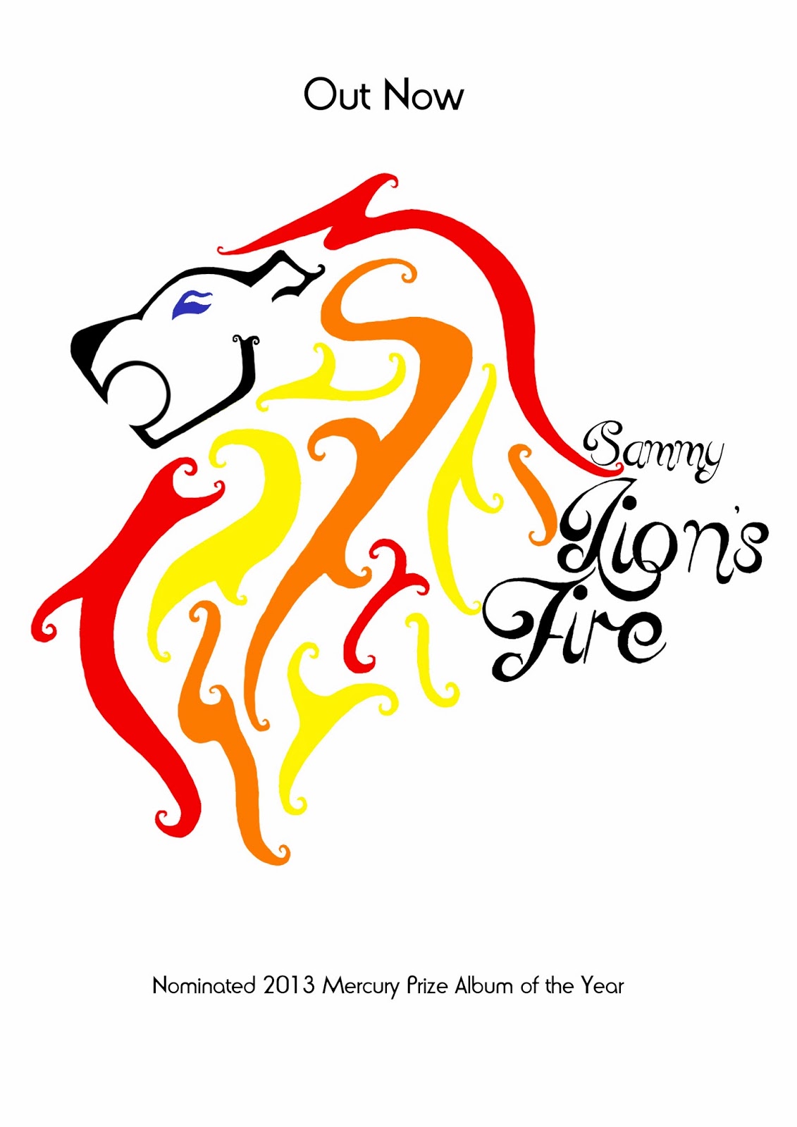
For my final digipak I have changed the colours for the Lion, making them more vibrant. By turning the dark grey face into black, the dull navy eye into a more defined blue and brightening the fire colours (red, orange and yellow) I have given the album fierceness and a sense of identity. I think the brighter colouring makes the digipak a lot more aesthetically pleasing and will therefore encourage consumers to purchase it. Another change that I have made to the lion is in the face and mouth. In the first design the face is longer and the mouth is quite small - whereas on the final design the face is shorter and the mouth is a lot larger. Again this makes the design much more refined and adds to the fierceness that I wanted to portray the artist as.

Another change I have made is to the Left Cover of my digipak. Instead of leaving it plain and simplistic, I have put the recurring image of flames on to both sides, however I have produced a symmetrical image of the flames, rather than having them climb up the side of the case as with the back cover, the back inside and the cover inside. Rather than simply layering the text on top of the flames, I have erased around the words in order to separate them from the flames so to draw in the audiences attention to the writing. I believe that this change also makes the digipak look more professional by having a constant theme of the flames on each section.

The back cover has been changed as well. To start with, I removed 'Sammy' from the page to make it look neater and removed the track entitled 'Lion's Fire' to avoid having a track with the same name as the album. I also created the record label 'Lightening Bolt Records' and produced the simple logo of a lightening bolt in order to make the digipak more professional. As with the rest of the sections, I have also brightened the flames to give the artwork a clean-cut appearance.
Tuesday 12 November 2013


Improvements to digipak
The improvements I have made to my digipak are because of the fact that it was unfinished due to the problems that had happened the previous time of my blog having an attempted hacker.
I have now changed it from a 6 panel digipak to a 4 panel digipak, this is because I found that there was too much open space or what I wanted to create, which was a simple but with each page filled with a different image or pattern.
I originally had on my digipak, a crinkled old paper design in the background, however, this didn't look as old as I wanted it to. The card design also didn't turn out how I had wished it to, this didn't create a very good look on the digipak cover, the black writing again didn't stand out against the brown paper background.
I have now changed the background to a pure black one, this means that the white writing will stand out on it really well. This also meant that Sammy's blonde hair stands out on the digipak cover, it also means that hair red and blue top stands out as well.
For the part where the CD would actually go I have created a paisley pattern that goes there, this is in black and white to go with the theme, this was originally another design that I created for the digipak that was to have Sammy's face made entirely out of the paisley pattern design that I created, this didn't look as effective as I had hoped though so I started over a again with the bold and quirky image of Sammy looking at a flower. This helps to go with the quirky object theme as this is another object that she is looking at.
I took the images with my camera and wanted an indie quirky style for them, I then transferred them into photo shop and edited them , removing stray hairs etc. this added a more professional quality to them. I then placed them on two panels of my 4 panel digipak. The photos are on the front cover and the inside left.
I made the writing on the back different as well because this helped to create a more quirky style for my digipak cover.
Monday 11 November 2013


Friday 8 November 2013


Issues with digipak
I have left the memory stick at home with all of my digipak and poster on, this will be uploaded ASAP.
Wednesday 6 November 2013
Story board redo
Over the next few lessons we are going to be redoing the story board for a our video making the improvements that are necessary to create a better more professional looking video.
Tuesday 5 November 2013
Evolution of my Digipak: Lion

I found this image on the internet after looking at pictures
of lions. I liked the tribal design and how the mane is
takes over most of the drawing, but the Lion's face is
still the main focus. The design is unusual and I wanted
to somehow incorporate it into my own work.
takes over most of the drawing, but the Lion's face is
still the main focus. The design is unusual and I wanted
to somehow incorporate it into my own work.

I started out by hand-drawing the image. I
wanted to make the design more feminine
so I added swirls to the end of each line,
instead of the sharp points. I also added more
lines into the mane and changed the eye
to have a separate crease in it, and I
changed it to match the rest of the style.
to have a separate crease in it, and I
changed it to match the rest of the style.

At the next stage, I scanned the drawing into Photoshop, erased the background and used the paintbrush to make the black lines bolder and thus easier to colour in later on. This was the most tedious stage in the process as I had to erase every little flaw at the edges of the drawing, making sure that the lines were smooth.

Finally, I edited the colours of the Lion. I chose to do the mane in red, orange and yellow as I wanted the colour of fire to be prominent in my design to make it look more interesting and unusual. The outline of the face is a dark grey colour and the eye is a dark blue as I didn't want to make it too harsh and draw attention away from the mane.
Friday 1 November 2013
Subscribe to:
Posts (Atom)