
Friday 27 December 2013
Thursday 26 December 2013
1. In what ways does your media product use, develop or challenge forms and conventions of real media products?
The projector style of the video comes from the music video by My Chemical Romance, Welcome to the Black Parade. This video was released in 2006 and is still featured on the music channels Kerrang! and Scuzz. I liked the projector effect when I saw it on the video, as it goes with the old fashioned and unusual theme - a theme which our video also shares. The song itself is a very different genre to 'Velvet Elvis' but the projector effect still goes well with our concept. Our video develops what MCR use in the video as we put the projector effect over the entire video, whereas in Welcome to the Black Parade has a more subtle projector effect when the band is playing.

 Inspiration for the colour filter on the music video comes for Green Day's Brain Stew, released 1996. This video has a sepia filter over the images, making for an aesthetically unusual video. I wanted our music video to have a similar sort of look to it, although our artist is a much different genre to Green Day, as I believed it would add to the quirky style and would fit in with the old fashioned theme - pairing well with the projector effect. However, our music video has a weaker, more subtle filter to Brain Stew, because I didn't want to overwhelm the viewer with the bright sepia tones as well as the projector style effect, so I chose to make the colour duller, choosing the filter 'Faded Sun' as opposed to the original sepia effect.
Fiona Apple's music video to Criminal, released in 1997, contains objects with sweeping camera movements passing over them. I like this style as it is more visually stimulating that a still camera so I chose to have this in our video to make it more interesting for the audience. However, unlike Criminal, our video does not use these sweeping shots when our artist is on screen because I thought that it would not fit in with the rest of the video. We achieved this look by taking photographs of the objects and manipulating them in final Cut Pro by using the Ken Burns tool in order to get the sweeping effect - which we found was a better way to do things considering the tools we had. I found that using a sweeping camera effect was too difficult to do with a hand held camera whereas with the Ken Burns tool we could achieve the look we wanted without the camera shaking. Therefore we have developed the technique used in Criminal by using it in certain shots of the video, and by adding the effect in during the editing stage of production.
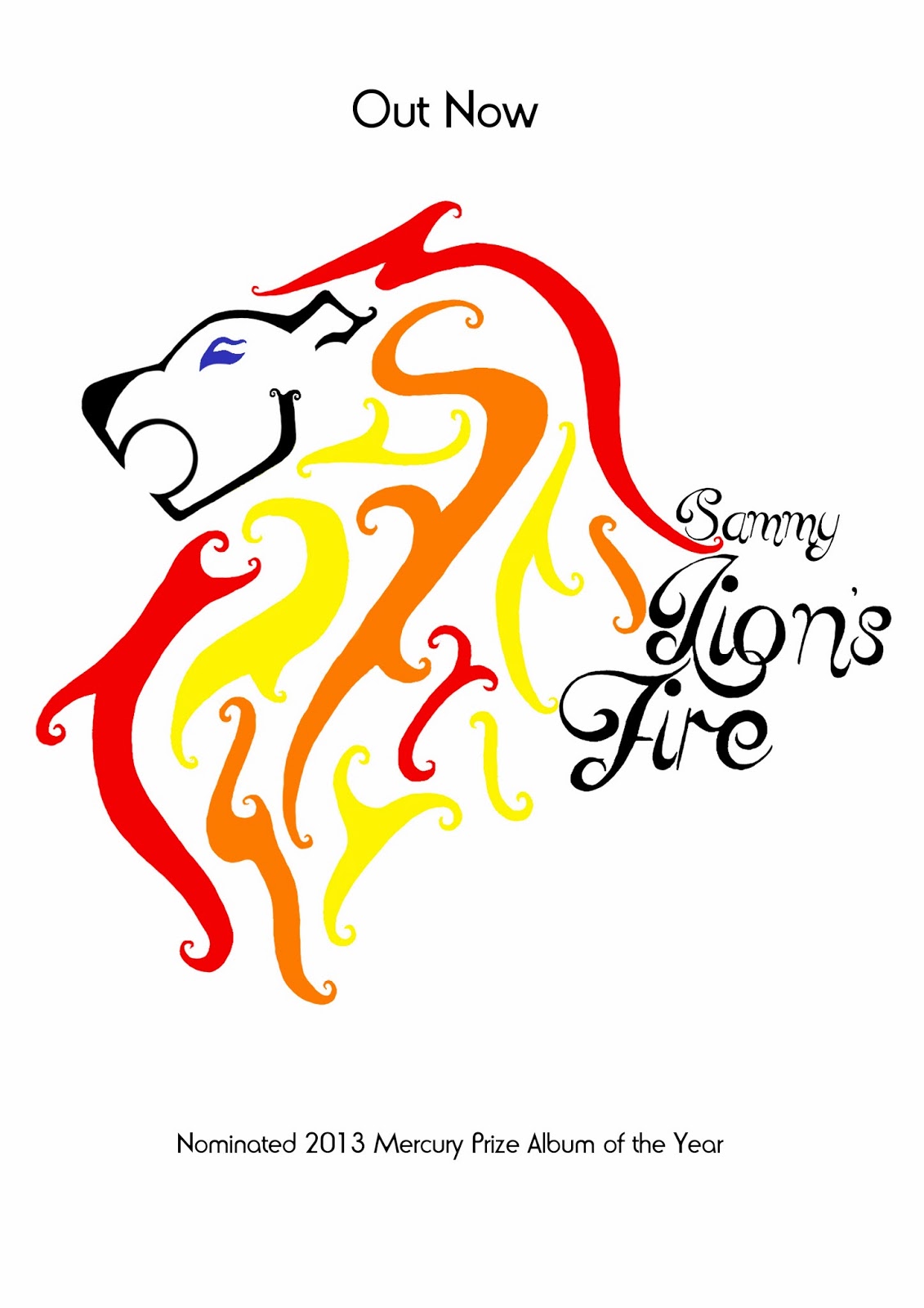
 In terms of my digipak and poster, I followed traditional conventions in having the name of the artist and title of the album on both products. Additionally, the font and main image is consistent across both items. This is because I want the audience to recognise that they belong to the same brand and therefore be encouraged to listen to the artist and buy the album. By having the image of the lion as the main image, this would lead to the audience associating Sammy with the 'logo' and could therefore lead to her building an identity as an artist - and the logo could easily be put on merchandise in order to create a greater revenue for the artist.
 However, I did challenge the idea of having a picture of the artist as the main image on the digipak and poster. Usually with young female artists, an image of them is used on the cover in order to promote them but I decided to not do this as I wanted my cover to be more artistic than simply having a photograph. Therefore I hand drew the image of the lion, and manipulated it in photoshop by adding colour and using the eraser tool to neaten edges. By having a piece of artwork on the digipak and poster rather than a photograph of the artist makes the album cover more unusual and eyecatching, so it will encourage consumers to buy the album and listen to the artist.
Inspiration for the colour filter on the music video comes for Green Day's Brain Stew, released 1996. This video has a sepia filter over the images, making for an aesthetically unusual video. I wanted our music video to have a similar sort of look to it, although our artist is a much different genre to Green Day, as I believed it would add to the quirky style and would fit in with the old fashioned theme - pairing well with the projector effect. However, our music video has a weaker, more subtle filter to Brain Stew, because I didn't want to overwhelm the viewer with the bright sepia tones as well as the projector style effect, so I chose to make the colour duller, choosing the filter 'Faded Sun' as opposed to the original sepia effect.Fiona Apple's music video to Criminal, released in 1997, contains objects with sweeping camera movements passing over them. I like this style as it is more visually stimulating that a still camera so I chose to have this in our video to make it more interesting for the audience. However, unlike Criminal, our video does not use these sweeping shots when our artist is on screen because I thought that it would not fit in with the rest of the video. We achieved this look by taking photographs of the objects and manipulating them in final Cut Pro by using the Ken Burns tool in order to get the sweeping effect - which we found was a better way to do things considering the tools we had. I found that using a sweeping camera effect was too difficult to do with a hand held camera whereas with the Ken Burns tool we could achieve the look we wanted without the camera shaking. Therefore we have developed the technique used in Criminal by using it in certain shots of the video, and by adding the effect in during the editing stage of production.
In terms of my digipak and poster, I followed traditional conventions in having the name of the artist and title of the album on both products. Additionally, the font and main image is consistent across both items. This is because I want the audience to recognise that they belong to the same brand and therefore be encouraged to listen to the artist and buy the album. By having the image of the lion as the main image, this would lead to the audience associating Sammy with the 'logo' and could therefore lead to her building an identity as an artist - and the logo could easily be put on merchandise in order to create a greater revenue for the artist.However, I did challenge the idea of having a picture of the artist as the main image on the digipak and poster. Usually with young female artists, an image of them is used on the cover in order to promote them but I decided to not do this as I wanted my cover to be more artistic than simply having a photograph. Therefore I hand drew the image of the lion, and manipulated it in photoshop by adding colour and using the eraser tool to neaten edges. By having a piece of artwork on the digipak and poster rather than a photograph of the artist makes the album cover more unusual and eyecatching, so it will encourage consumers to buy the album and listen to the artist.Friday 20 December 2013

Question 2 - FINAL
For this question I created a web page this was then used to be able to answer the question
Question 1 - FINAL
I have created a review for this question which I have made a blog for
The link is below;
http://thebalancedreviewer.blogspot.co.uk/
The link is below;
http://thebalancedreviewer.blogspot.co.uk/
Thursday 19 December 2013
Evaluation question 4 - redo
Computer/ laptop - The computer and laptop were essential for the video, if you didnt have them then there would be no project to begin with, these were used for saving images, video footage, being able to use the internet and research different types of media that could be used as inspiration for my video and digipak, they also allowed for the different pieces of software to work such as photoshop and also allowed for the different photos that had been taken to transfer over to the software.
The next useful piece of technology that was used was the internet, we used web 2.0. Without the internet I wouldn't be able to research different images and videos, be able to upload my videos to websites like youtube or upload my research to my blog on blogger, the internet had all of the pieces of research that we wanted on it and this was vital when making our video in order to make sure that we had all of the different pieces that would make sure that our video looked in the right time frame e.g. researching and finding clothing etc.
Blogger - Blogger was important as this is what we used to be able to upload all of our research and planning. This was used as a data base to store all of the information that we found out, so that we could gain feedback from peers and our teacher, also to be able to access inspirational ideas and previous research quickly and with ease. It also allowed us to be able to upload a link to our video from youtube on there and then upload our digipaks and posters onto there from photoshop. This allowed easy access to all of the previous work that we had done such as animoto's and animatics.
Animoto - We used animoto as this was great for creating an easy flowing pitch that could play on its own and have all of the pieces of information that we needed on it, this helped to show our audience what the video would be about, it also helped to have all our research neatly organized in the same place, it gave a clear overview with out being over complicated of what our video was about. Animoto was easy to use as you could upload images and words with background music to help portray our creative vision to our peers and our teacher, we then embedded the animoto into the blog to allow us to easily access it again when need be.
Twitter - This was used to be able to upload comments from our artist making them seem more realistic, it was also used to be able to keep up to date with what was going on in class because of the school twitter feed that allowed for us to be able to know useful websites and also to help us gain feedback from our teacher when we needed it.
Android phone - I used this to be able to communicate with Hannah as to be able to arrange what time should be at places also to be able to send photos of different ideas as well as being able to text to communicate what was going on and when. I also used my android phone to be able to phone and text our model Sammy so that she knew when to be turning up to locations and where about they were. This was important as we needed to be able to communicate in order to be able to know what was going on when. Communication is a key skill when working on a music video as you need to be and to work with the singers and other members of the team in order to be able to produce a good video.
Email - Email was useful because without it certain clips and images couldn't be sent to one and other, this is also where we received email from possible locations or where we ordered the outfits from to notify when they should be arriving along with other prop orders, we used email to be able to say when certain parts were done of the animoto or when we had uploaded blog posts, this was another important way to communicate as some of the different clips and photos were too big to be able to send over facebook or text message.
Facebook was used to be able to send a group message between me, Hannah and our model Sammy, we did this as it was a good form of communication that we could all talk to eachother at the same time. I also asked friends over message for feedback on my digipak, poster and music video, this was another good way of being able to communicate, however, it wasnt very good at being able to send images and videos quickly which is why email was a lot better.
Ipod - I used my iPod a lot throughout the whole process and found it very easy and very useful to use. This was because it was able to take photos and videos of what we were doing throughout the process, I also found that I could download a blogger app where I could write posts on the go and also check was going on, on the blog, my iPod also connected up to the iMacs really easily and this was good as it meant that I could download my contents all into the one place which was really useful, this was quick and easy to do, my iPod also allowed me to be able to download images, search google, use google chrome, access my emails and facebook etc.
Google - Google was one of the most important websites that we used, this was because it was used to be able to do web searches, to be able to look at images and gain images from all different individual websites under the one search, giving us more chance to be able to gain a lot of research, google could be easily accessed from my android phone, iPod, computer, laptop and also the iMacs meaning that it was a versatile search engine to be able to access with ease.
iMacs - I was able to use the iMacs at school to be able use the internet and edit photos on photoshop, they were also used for using final cut pro, as well as being able to post on our blogs and also being able to connect up to my ipod easily, they could also have the photos and video clips downloaded on to them really easily as you could just place the memory card into the slot in the side of the iMac and the files would then come up without having to get a USB cable or a memory card reader.
Still Camera - I used a still camera to take photo's of our model, this was used on my digipak and poster in order to be able to photoshop and edit them on a computer or Mac. I found that by using a still camera I could take high quality images of the artist. Also we used a still camera in order to be able to take photos of the different objects that were in our music video as well as being able to take photos through out the process of what we were doing e.g. filming, storyboard etc. for the still camera we were using a memory card in it and to transfer the images after we had to use a memory card reader and USB cable to transfer the images across to the computer or if we were using a mac we transferred them across.
Video Camera - The video camera was a crucial piece of technology that was needed in order to be able to film the different clips needed for our draft video and our final video, this was used by placing a memory card into it, what we did find was that the camera drained the batteries extremely fast and that we kept on having to replace them. The video camera could film all that was necessary and also it was easy to transfer the footage over to the macs for editing on final cut pro.
Photoshop - When I was creating my digipak and poster I used this programme to be able to create a convincing looking product. Once I got used to it, it was an easy piece of software to use allowing me to be able to remove any imperfections on the photo I had taken and remove the backgrounds as well. This software also allowed me to be able to add different layers so I could create the poster and digipak adding fonts and different colours to it. I could use this on both the macs and also computers and this could easily be transferred onto a memory stick to be able to do it at home as well as at school.
Memory card - This was used to be able to store the information on when we were using the different cameras and video cameras, the macs were really good for being able to upload this to as this meant that they could have the memory card put into them directly meaning that the footage we had filmed could be transferred across seamlessly.
Memory card reader - To be able to transfer the video from the camera over to the computers we used a memory card reader. This allowed us to be able to easily transfer the information we had just recorded on to a computer. This was also used for transferring images off of the still cameras aswell and I found that this was useful and easy to use.
Memory stick - The memory stick was used to be able to transfer work from home to school, such as the images, video recordings, photoshop files etc. this could be put into the computers and meant that I could upload different pieces of work easily from computer to computer. It also was useful because it meant that if something went wrong with one file I had a back up on my memory stick.
Final cut pro - Final cut pro was used to be able to put the whole of the video together on the Macs, allowing for us to add effects over the top of it and also allowing us to put the clips in the order that we needed where. It allowed for the footage to be edited and also allowed for the music to be played over the top of the clips allowing us to create our music video. The Final cut Pro video file was also easily exported and easily uploaded on to youtube.
Youtube - Youtube has allowed us to be able to upload the video, animatic and draft video. This is a very useful tool as it also allowed us to view what other videos were out there in order to be able to create a convincing video, we have been able to find different inspiration from the vast amount of videos on youtube and also allowed us to embed and share our video with others through our blog.
The next useful piece of technology that was used was the internet, we used web 2.0. Without the internet I wouldn't be able to research different images and videos, be able to upload my videos to websites like youtube or upload my research to my blog on blogger, the internet had all of the pieces of research that we wanted on it and this was vital when making our video in order to make sure that we had all of the different pieces that would make sure that our video looked in the right time frame e.g. researching and finding clothing etc.
Blogger - Blogger was important as this is what we used to be able to upload all of our research and planning. This was used as a data base to store all of the information that we found out, so that we could gain feedback from peers and our teacher, also to be able to access inspirational ideas and previous research quickly and with ease. It also allowed us to be able to upload a link to our video from youtube on there and then upload our digipaks and posters onto there from photoshop. This allowed easy access to all of the previous work that we had done such as animoto's and animatics.
Animoto - We used animoto as this was great for creating an easy flowing pitch that could play on its own and have all of the pieces of information that we needed on it, this helped to show our audience what the video would be about, it also helped to have all our research neatly organized in the same place, it gave a clear overview with out being over complicated of what our video was about. Animoto was easy to use as you could upload images and words with background music to help portray our creative vision to our peers and our teacher, we then embedded the animoto into the blog to allow us to easily access it again when need be.
Twitter - This was used to be able to upload comments from our artist making them seem more realistic, it was also used to be able to keep up to date with what was going on in class because of the school twitter feed that allowed for us to be able to know useful websites and also to help us gain feedback from our teacher when we needed it.
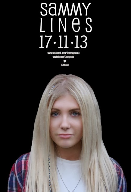
Android phone - I used this to be able to communicate with Hannah as to be able to arrange what time should be at places also to be able to send photos of different ideas as well as being able to text to communicate what was going on and when. I also used my android phone to be able to phone and text our model Sammy so that she knew when to be turning up to locations and where about they were. This was important as we needed to be able to communicate in order to be able to know what was going on when. Communication is a key skill when working on a music video as you need to be and to work with the singers and other members of the team in order to be able to produce a good video.
Email - Email was useful because without it certain clips and images couldn't be sent to one and other, this is also where we received email from possible locations or where we ordered the outfits from to notify when they should be arriving along with other prop orders, we used email to be able to say when certain parts were done of the animoto or when we had uploaded blog posts, this was another important way to communicate as some of the different clips and photos were too big to be able to send over facebook or text message.
Facebook was used to be able to send a group message between me, Hannah and our model Sammy, we did this as it was a good form of communication that we could all talk to eachother at the same time. I also asked friends over message for feedback on my digipak, poster and music video, this was another good way of being able to communicate, however, it wasnt very good at being able to send images and videos quickly which is why email was a lot better.
Ipod - I used my iPod a lot throughout the whole process and found it very easy and very useful to use. This was because it was able to take photos and videos of what we were doing throughout the process, I also found that I could download a blogger app where I could write posts on the go and also check was going on, on the blog, my iPod also connected up to the iMacs really easily and this was good as it meant that I could download my contents all into the one place which was really useful, this was quick and easy to do, my iPod also allowed me to be able to download images, search google, use google chrome, access my emails and facebook etc.
Google - Google was one of the most important websites that we used, this was because it was used to be able to do web searches, to be able to look at images and gain images from all different individual websites under the one search, giving us more chance to be able to gain a lot of research, google could be easily accessed from my android phone, iPod, computer, laptop and also the iMacs meaning that it was a versatile search engine to be able to access with ease.
iMacs - I was able to use the iMacs at school to be able use the internet and edit photos on photoshop, they were also used for using final cut pro, as well as being able to post on our blogs and also being able to connect up to my ipod easily, they could also have the photos and video clips downloaded on to them really easily as you could just place the memory card into the slot in the side of the iMac and the files would then come up without having to get a USB cable or a memory card reader.
Still Camera - I used a still camera to take photo's of our model, this was used on my digipak and poster in order to be able to photoshop and edit them on a computer or Mac. I found that by using a still camera I could take high quality images of the artist. Also we used a still camera in order to be able to take photos of the different objects that were in our music video as well as being able to take photos through out the process of what we were doing e.g. filming, storyboard etc. for the still camera we were using a memory card in it and to transfer the images after we had to use a memory card reader and USB cable to transfer the images across to the computer or if we were using a mac we transferred them across.
Video Camera - The video camera was a crucial piece of technology that was needed in order to be able to film the different clips needed for our draft video and our final video, this was used by placing a memory card into it, what we did find was that the camera drained the batteries extremely fast and that we kept on having to replace them. The video camera could film all that was necessary and also it was easy to transfer the footage over to the macs for editing on final cut pro.
Photoshop - When I was creating my digipak and poster I used this programme to be able to create a convincing looking product. Once I got used to it, it was an easy piece of software to use allowing me to be able to remove any imperfections on the photo I had taken and remove the backgrounds as well. This software also allowed me to be able to add different layers so I could create the poster and digipak adding fonts and different colours to it. I could use this on both the macs and also computers and this could easily be transferred onto a memory stick to be able to do it at home as well as at school.
Memory card - This was used to be able to store the information on when we were using the different cameras and video cameras, the macs were really good for being able to upload this to as this meant that they could have the memory card put into them directly meaning that the footage we had filmed could be transferred across seamlessly.
Memory card reader - To be able to transfer the video from the camera over to the computers we used a memory card reader. This allowed us to be able to easily transfer the information we had just recorded on to a computer. This was also used for transferring images off of the still cameras aswell and I found that this was useful and easy to use.
Memory stick - The memory stick was used to be able to transfer work from home to school, such as the images, video recordings, photoshop files etc. this could be put into the computers and meant that I could upload different pieces of work easily from computer to computer. It also was useful because it meant that if something went wrong with one file I had a back up on my memory stick.
Final cut pro - Final cut pro was used to be able to put the whole of the video together on the Macs, allowing for us to add effects over the top of it and also allowing us to put the clips in the order that we needed where. It allowed for the footage to be edited and also allowed for the music to be played over the top of the clips allowing us to create our music video. The Final cut Pro video file was also easily exported and easily uploaded on to youtube.
Youtube - Youtube has allowed us to be able to upload the video, animatic and draft video. This is a very useful tool as it also allowed us to view what other videos were out there in order to be able to create a convincing video, we have been able to find different inspiration from the vast amount of videos on youtube and also allowed us to embed and share our video with others through our blog.
Tuesday 10 December 2013
4. How did you use media technologies in the construction and research, planning and evaluation stages?
Pre-production
Production
Post production
- Blogger - This was primarily used to store and present our work, such as research and planning and music video analysis. It acted as documentation for the different stages of our music video and enables people to see what we've done. Blogger is accessible from any computer or device that connects to the internet so it can used to do our work anywhere at any time.
- YouTube - This website source of inspiration, allowing us to look at other music videos by professional producers and artists, as well as examples of work by other students. YouTube also acted as a place we could upload our videos (the animatic, first draft, and final draft) to make them accessible on the internet. YouTube allows for videos to be embedded, so this was a useful way of putting all the videos on our blog.
- Google - Was a useful website I used to search for inspiration, such as the images for the mood board. I could find information about relevant or similar artists to our own, and view their digipaks, so was very helpful in providing a basis for my own.
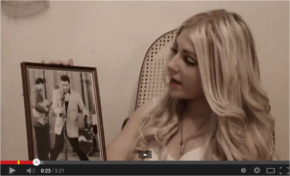
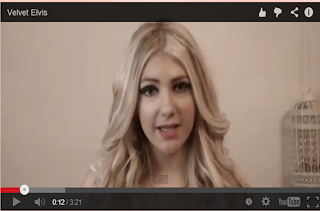
- iPod - My iPod gave us access to potential music for our video and is how I found the song 'Velvet Elvis'. I wanted the song to be something that one of us already knew so looked through my music to find a song that would be appropriate and effective to create a video for.
- Memory Stick - This was surprisingly the most useful tool in the creation of my digipak. I could use it to transfer files from one computer to the next, thus allowing me to do my work at anytime, anywhere.
- Windows Movie Maker - This is the software that I used to create the animatic. It is easy to use and free to download onto any windows computer, so was accessible from home when I needed it.
- Android Phone - A way for us to keep in touch with one another, and was used in setting up times an places for filming between us both and the actor. Additionally, it connects to the internet thus I could access blogger so I had the option of doing my work on the go. Using this also allowed me to take the photos for research and planning of digipak, from the books I used.
Production
- Fujifilm FinePix S4500 Camera - This is my personal camera that we used for the filming of the music video. As well as recording videos, it takes photographs, which we used to capture the images of objects throughout the video. We they manipulated these videos in post production using the Ken Burns Effect on Final Cut Pro. To keep the camera steady we used a tripod, which also aided in keeping shots at the same distance - because we filmed all the long shots together, then all the mid shots, and so on.
- Memory Card - This was used with the camera to enable me to save my filming and later upload it to a computer. It was useful in that it was easy to transport to and from school, so I could put the filming onto the school Macs.
- Photoshop - I used this software in the creation of my digipak. It allowed me to turn the hand drawn picture into digital art that I could easily manipulate in terms of colour, style and layout - making it brighter colours, erasing any imperfections, and adding or taking away the swirls. I was already familiar with this from my AS coursework, but learned a lot about how to turn a hand drawn image into something digital.
- Lenovo Laptop - This is my personal laptop that I used to create my digipak. I completed most of my digipak on this as it runs Photoshop, and my memory stick allowed me to easily transport work from the school computer to this laptop so I could do work from home. It aided in the production of the music video as we played the song through the speakers while filming, so our actress could sing along to make the video.
Post production
- iTunes - I used this software to download 'Velvet Elvis' onto the computer and therefore could transfer it onto the video editing software so that it could be imported into the final video, providing a crisp and clear sound for the music, as opposed to using the music that was played during the filming on the camera, which was filled with background noise.
- Mac - This was primarily used for editing the music video. It contained software that was exclusive to Apple computers, so I uploaded the film from the camera to the Mac in order to edit the video.
- Final Cut Pro - This was the program that I used to edit the video. It allowed us to put the separate clips from the camera together and overlay different effects onto the images, such as 'projector' or 'faded sun' which we used in the final piece. It also connected to iTunes so we could put the song onto Final Cut Pro thus it would be clearer as the music on the video.
Evaluation 1 update
EVALUATION 1. In what ways does your media product use, develop or challenge forms and conventions of real media products?
Video and digipak style
Video and digipak style
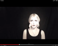
The style of the makeup that we chose was down to the fact that the song sounds very much as though it is from an era that is older than the modern day music, this is because of the artists voice. Also the fact that she is singing about Elvis Presley who is from the 50's we wanted a style of clothing that fitted with this sort of girl who is obsessed with Elvis Presley (MENTION ELVIS 68 COMEBACK HERE). We used the 60's style makeup similar to Twiggy's on the eyes.
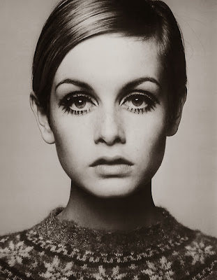
Also we used a 50's style red lip because of the fact that Elvis was from the 50's and it stood out a lot in front of the camera. This created the bold dramatic look that we wanted to fit in with the theme of the video. This has all been used before as shown in these pictures of Marilyn Monroe and Twiggy, this shows that this was in no way original but simply using something to fit with the theme of the video.

The moving images at the start and on each Individual beat with no lyrics were taken inspiration from Fiona Apple's song criminal.
This Is a clip from Fiona Apple's song
This is a clip from our music video.
WHAT ELEMENTS FROM THESE VIDEOS DID YOU DEVELOP OR USE?
In order to make ours slightly different and challenge conventions we placed two effects over the top during the editing process. These were one to make in look more old and sepia and the other to make it look more like it was being projects to add a bit more jumpy movement through out the video, this was to emphasise and illustrate the nostalgic feel. The reference to velvet in the songs title reminded us of 'tipping the velvet', a BBC TV drama set at the turn of the 19th century so we employed the sepia effect to acknowledge this subtle reference.
The inspiration for the sepia effect also came from some photos that were up around my house and where I had seen other various different photos with a sepia filter over the top.
One of the images from home

A screenshot from our video
I then gained inspiration from the Charlie Chaplin silent films. I was looking at these because I thought of all of the music artists such as Elvis Presley from the 50's but thinking further back to old stars I found this inspiring and would work the vintage theme that we were going along. I feel we have developed this idea in our video
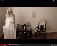
Another really big influence and one we felt we used for our video was where we were going to film the video, we wanted to film it in a room that had plain walls and preferable i wooden floor, this was taken from Birdy's self titled album art work. In this image you had a girl standing in an empty room with really decrepit old wall paper and a wooden floor, this was emulated in our video as we had a wooden floor and a plain wall, however, we decided to change it by having the room filled with objects that our artist could interact with. We also took inspiration from the room used in the Kings Speech


In our room we have more objects.
Sven's E Carlsons theory is also well applied to this video. This is because there are both performance and conceptual clips in our music video. Our model Sammy is seen lip syncing to the camera and dancing this is the performance part of the video. This could be applied to many other videos where dancing and singing can be seen giving a performance video. These include Mindy Gledhill and Taylor Swift.
Mindy Gledhill has some performance in the video as she is looking directly at the camera and lip syncing, this was created after our video was, this shows that this happens all the time and that lots of people have the same ideas about moving objects.
Mindy Gledhill also has a conceptual part of the video where there are objects that are being looked at. This is similar to part of our video where there are the objects being shown to the camera and then moving up and down or to different sides.
I feel that we aren't challenging any conventions, this is because all of the videos whether they are artsy, indie, have a rock edge all have the same basic principals of following a story line, performing or going abstract. This means that everything that has been in our video has been seen and used before. This means that we are not challenging any conventions. The lead up to the chorus and bridge are the same as other music video's with each of the lyrics being acted out by different actions.
The camera shots in the video doesnt challenge any conventions either because in music video's there tends to be a variety of different shots; close ups, mid shots and long shots. In our video we have primarily, long shots, mid shots and closeups. These are all sticking to the conventions of a typical music video.
A close up is used through out the whole of The PaperKites video 'young' this shows that we are following conventions by using a closeup. Although this video does seem to be challenging conventions as it is using loads of different short closeups throughout the whole of the video.
This is a clip from a Taylor Swift music video called 'Begin Again' this shows Taylor Swift sitting down in a long shot, this shows that we are following typical music video conventions as this has been seen before in other music videos giving them a variety of shots.
This is a still from a coldplay music video - paradise, in this video there is a mixture of different shots, including midshots, this shows that again it is following the conventions of a typical music video.
I feel that we have challenged the conventions of a typical video because we have put a lot less camera movement into our video, however, I feel that we haven't challenged conventions of the specific genre that we are doing because there was a lot of different objects to be able to interact with and play out the different lines of the song.
For my digipak I believe that it really isn't challenging any conventions, this is because I took a lot of inspiration from two different album covers. As I did this it meant that I was sticking to something that I knew worked, because of this I hadn't really challenged anything.
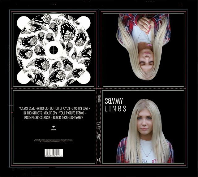

The paisley pattern that was placed in the CD holder was also taken inspiration from album cover because of the way that she is covered in different patterns. The chosen pattern was taken from this image which I thought had the right shapes and style that could go on my digipak.


The circles are continued into the date which is when the album is released.
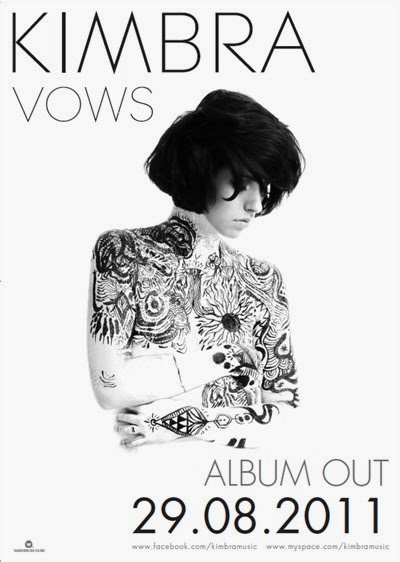
I have continued the same theme with the same image on to the poster helping to create a brand which cant be mistaken this was taken from Kimbra's Poster for Vows and the album as they had the same image and font on the poster as they did the album.

I decided to stick to a one work title for the name 'Lines' I did this for a bold impact and also to go with the fact that the artist only had a one word name, this again gave it a more strong name, I took this inspiration from Kimbra's album called 'Vows'. I chose to do a picture of the artist on the front of the album as well as the inside of the cover, this was to help show the identity between the artist in the video can be related to the artist on the front of the digipak. The writing was placed in the top left hand corner of the front cover, this was again taken from Kimbra's album 'Vows'.


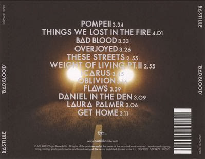
I then decided that for the tracklisting on the back I would have it going continuously across with no number down the side, this was so then it was centred. I didn't realise this at the time but only now that I am doing this task that I have a similarity between the back of my digipak and the back of Bastille's Bad Blood album.

Although mine is slightly different because I have placed the titles going continuously, I have centred it and made it symmetrical placing circles at the end so that I have seperations between each of the titles. Although I have changed mine compared to what the Bastille album's tracklisting looks like I have no way created that out of my own imagination and it would be found on many different albums or wherever there is writing.
My poster has also stuck to the conventions as it has followed the style of the digipak's tracklisting on the back by having everything centred. This includes the image and the writing.

I have continued the same theme with the same image on to the poster helping to create a brand which cant be mistaken this was taken from Kimbra's Poster for Vows and the album as they had the same image and font on the poster as they did the album.
Saturday 7 December 2013
Evaluation Question 4
Pre Production;
Blogger - Blogger was important as this is what we used to be able to upload all of our research and planning. This was used as a data base of all of the information that we found out.
Animoto - We used animoto as this was great for creating an easy flowing pitch that could play on its own and have all of the pieces of information that we needed on it.
Twitter - This was used to be able to upload comments from our artist making them seem more realistic
Android phone - This was used to be able to communicate ideas to and from me and Hannah, this was useful throughout the whole process as this helped to communicate between our model and us.
Email - Email was useful because without it certain clips and images couldn't be sent to one and other, this is also where we received email from possible locations or where we ordered the outfits from to notify when they should be arriving along with other prop orders.
Internet - We used the internet 2.0 as this was probably one of the biggest factors of finding inspirational images and video clips, it was also where we could upload our digipaks, posters and music video to, this was useful for the whole entire process as we were constantly having to use websites in order to find out information.
Ipod - I used my ipod a lot throughout the whole process and found it very easy to use. This was because it was able to take photos and videos of what we were doing throughout the process, I also found that I could download a blogger app where I could write posts on the go and also check was going on, on the blog.
Production;
Still Camera - I used a still camera to take photo's of our model, this was used to put onto my digipak and poster in order to be able to photoshop and edit them on a computer or Mac. I found that by using a still camera I could take high quality images of the artist. Also we used a still camera in order to be able to take photos of the different objects that were in our music video as well as being able to take photos through out the process of what we were doing e.g. filming, storyboard etc.
Video Camera - The video camera was a crucial piece of technology that was needed in order to be able to film the different clips needed for our draft video and our final video.
Photoshop - When I was creating my digipak and poster I used this programme to be able to create a convincing looking product. Once I got used to it, it was an easy piece of software to use allowing me to be able to remove any imperfections on the photo I had taken and remove the backgrounds as well. This software also allowed me to be able to add different layers so I could create the poster and digipak adding fonts and different colours to it.
Post production;
Final cut pro - Final cut pro was used to be able to put the whole of the video together, allowing for us to add effects over the top of it and also allowing us to put the clips in the order that we needed.
Youtube - Youtube has allowed us to be able to upload the video, animatic and draft video. This is a very useful tool as it also allowed us to view what other videos were out there in order to be able to create a convincing video.
Evaluation Question 2 Draft
The Digipak that I have created has an image of the music artist that is also in the video. This is helping to link the digipak cover to the music video, this is because the same face is on two different products.

The writing that's on both the digipak and the poster is good because it is sort of quirky which is how the song is.
The track listing on the back of the digipak cover I feel is also quite quirky as the different names of the songs are written in the quirky writing again and also because the songs are called different names such as Violet spy, Black Dice, Bold Faced Silence. These are all quirky and this is good because they help to link to the songs title of Velvet Elvis.
Although the imgae of my artist helps to link it to the video, the two images don't have the same style with the heavy eyeliner and wavy hair or even the clothing. This probably wouldn't help to link it to the video as the clothing is very different.
The same quirky but minimalist style is followed throughout the whole process helping to create a strong image and following similar things used by different artists such as Kimbra, she has the same image on both her album and her poster this helps to create a strong brand and also helps the digipak and poster advertise the same product so that people know its from the same artist.


The writing that's on both the digipak and the poster is good because it is sort of quirky which is how the song is.
The track listing on the back of the digipak cover I feel is also quite quirky as the different names of the songs are written in the quirky writing again and also because the songs are called different names such as Violet spy, Black Dice, Bold Faced Silence. These are all quirky and this is good because they help to link to the songs title of Velvet Elvis.
Although the imgae of my artist helps to link it to the video, the two images don't have the same style with the heavy eyeliner and wavy hair or even the clothing. This probably wouldn't help to link it to the video as the clothing is very different.

The same quirky but minimalist style is followed throughout the whole process helping to create a strong image and following similar things used by different artists such as Kimbra, she has the same image on both her album and her poster this helps to create a strong brand and also helps the digipak and poster advertise the same product so that people know its from the same artist.
Friday 6 December 2013
2. How effective is the combination of your main product and ancillary text?
Firstly, the text at the start of the video is similar to that of the digipak in that they are aesthetically similar and simplistic. They are both consisting of a single colour and thin lines to make each letter. The font on the digipak is clearly different to that of the video as it is more rounded to fit in with the swirls of the images on the digipak and the video font is more fitting in with the quirky vintage theme of the video.


Additionally, a common feature between the video and digipak is animals. The main image on the digipak is a drawing of a lion and the video contains a picture of a Leopard, as well as a bird in the birdcage, a wooden owl and the bear. Other animal references that are less noticeable are the sea horse in the triangular glass sculpture and the seal bone next to it. I included these because I wanted to bring a more natural element into the video.
One of the main differences between the video and the digipak is the colour schemes. The digipak has much brighter vibrant colours whereas the video has sepia tones due to the vintage theme. This is because I wanted the digipak to be more eye-catching and stand out on a CD rack, and the poster needed to catch people's attention - thus encouraging them to buy the album or check out the artist.

Another difference between the video and the digipak is the name of the artist. On the digipak, 'Sammy' is a swirly, flowing font - whereas on the video it is a simpler straighter font. This is because I wanted to make each font fit with the style of what I was creating, so the digipak was a lot more swirled and flowing whereas the video was more vintage and quirky.
The digipak is more clean cut, differing from the projector-like style of the video because I wanted the digipak to appeal to a wider audience. Fans of the artist are most likely to watch her video on YouTube or music channels on television, whereas the general public are likely to see her album artwork in shops or the poster on the street, therefore I wanted the digipak to be something that appealed to everyone, rather than just a small audience.


The track listing on the digipak links to the video as it contains the title 'Velvet Elvis' on it, as well as other quirky titles that fit in with the random and unusual theme - seen in the video by the way the artist interacts with the random and unusual objects.
Another feature associated with both pieces is that of femininity. This is portrayed in the video by the hair, make-up, and flowing dress. In the digipak it is illustrated by the swirls with the lettering and artwork. As the artist is a female I thought it was important to put that across in the digipak by using the swirls as there was no image of her on the packaging, and in the video it is important that she looks appealing to audiences thus I made her hair and make-up look attractive.Additionally, a common feature between the video and digipak is animals. The main image on the digipak is a drawing of a lion and the video contains a picture of a Leopard, as well as a bird in the birdcage, a wooden owl and the bear. Other animal references that are less noticeable are the sea horse in the triangular glass sculpture and the seal bone next to it. I included these because I wanted to bring a more natural element into the video.
One of the main differences between the video and the digipak is the colour schemes. The digipak has much brighter vibrant colours whereas the video has sepia tones due to the vintage theme. This is because I wanted the digipak to be more eye-catching and stand out on a CD rack, and the poster needed to catch people's attention - thus encouraging them to buy the album or check out the artist.

Another difference between the video and the digipak is the name of the artist. On the digipak, 'Sammy' is a swirly, flowing font - whereas on the video it is a simpler straighter font. This is because I wanted to make each font fit with the style of what I was creating, so the digipak was a lot more swirled and flowing whereas the video was more vintage and quirky.
The digipak is more clean cut, differing from the projector-like style of the video because I wanted the digipak to appeal to a wider audience. Fans of the artist are most likely to watch her video on YouTube or music channels on television, whereas the general public are likely to see her album artwork in shops or the poster on the street, therefore I wanted the digipak to be something that appealed to everyone, rather than just a small audience.


Evaluation Question 1
EVALUATION 1. In what ways does your media product use, develop or challenge forms and conventions of real media products?
The style of the makeup that we chose were down to the fact that the song's sounds very much as though it is from an era that is older than the modern day music, this is because of the artists voice. Also the fact that she is singing about Elvis Presley who is from the 50's we wanted a style of clothing that fitted with this sort of girl who is obsessed with Elvis Presley. We used the 60's style makeup similar to Twiggy's on the eyes.
Also we used a 50's style red lip because of the fact that Elvis was from the 50's and it stood out a lot in front of the camera. This created the bold dramatic look that we wanted to fit in with the theme of the video.
The moving images at the start and on each Individual beat with no lyrics were taken inspiration from Fiona Apple's song criminal.
This Is a clip from Fiona Apple's song
This is a clip from our music video.
In order to make ours slightly different we placed two effects over the top during the editing process. These were one to make in look more old and sepia and the other to make it look more like it was being projects to add a bit more jumpy movement through out the video.
The inspiration for the sepia effect came from some photos that were up around my house and where I had seen other various different photos with a sepia filter over the top.
One of the images from home
A screenshot from our video
I then gained inspiration from the Charlie Chaplin silent films. I was looking at these because I thought of all of the music artists such as Elvis Presely from the 50's but thinking further back to old stars I found this inspiring and would work the vintage theme that we were going along.
Another really big influence for our video was where we were going to film the video, we wanted to film it in a room that had plain walls and preferable i wooden floor, this was taken from Birdy's self titled album art work. In this image you had a girl standing in an empty room with really decrepit old wall paper and a wooden floor, this was emulated in our video as we had a wooden floor and a plain wall, however, we decided to change it by having the room filled with objects that our artist could interact with.
In our room we have more objects.
For my digipak I believe that it really isn't challenging any conventions, this is because I took a lot of inspiration from two different album covers. As I did this it meant that I was sticking to something that I knew worked, because of this I hadn't really challenged anything.
The paisley pattern that was placed in the CD holder was also taken inspiration from album cover because of the way that she is covered in different patterns. The chosen pattern was taken from this image which I thought had the right shapes and style that could go on my digipak.
The circles are continued into the date which is when the album is released.
I have continued the same theme with the same image on to the poster helping to create a brand which cant be mistaken this was taken from Kimbra's Poster for Vows and the album as they had the same image and font on the poster as they did the album.
I decided to stick to a one work title for the name 'Lines' I did this for a bold impact and also to go with the fact that the artist only had a one word name, this again gave it a more strong name, I took this inspiration from Kimbra's album called 'Vows'. I chose to do a picture of the artist on the front of the album as well as the inside of the cover, this was to help show the identity between the artist in the video can be related to the artist on the front of the digipak. The writing was placed in the top left hand corner of the front cover, this was again taken from Kimbra's album 'Vows'.
I then decided that for the tracklisting on the back I would have it going continuously across with no number down the side, this was so then it was centred. I didn't realise this at the time but only now that I am doing this task that I have a similarity between the back of my digipak and the back of Bastille's Bad Blood album.
Although mine is slightly different because I have placed the titles going continuously, I have centred it and made it symmetrical placing circles at the end so that I have seperations between each of the titles. Although I have changed mine compared to what the Bastille album's tracklisting looks like I have no way created that out of my own imagination and it would be found on many different albums or wherever there is writing.
My poster has also stuck to the conventions as it has followed the style of the digipak's tracklisting on the back by having everything centred. This includes the image and the writing.
I have continued the same theme with the same image on to the poster helping to create a brand which cant be mistaken this was taken from Kimbra's Poster for Vows and the album as they had the same image and font on the poster as they did the album.
Tuesday 3 December 2013
Subscribe to:
Posts (Atom)