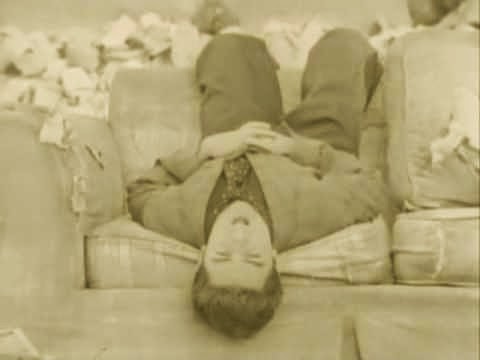
 Inspiration for the colour filter on the music video comes for Green Day's Brain Stew, released 1996. This video has a sepia filter over the images, making for an aesthetically unusual video. I wanted our music video to have a similar sort of look to it, although our artist is a much different genre to Green Day, as I believed it would add to the quirky style and would fit in with the old fashioned theme - pairing well with the projector effect. However, our music video has a weaker, more subtle filter to Brain Stew, because I didn't want to overwhelm the viewer with the bright sepia tones as well as the projector style effect, so I chose to make the colour duller, choosing the filter 'Faded Sun' as opposed to the original sepia effect.
Fiona Apple's music video to Criminal, released in 1997, contains objects with sweeping camera movements passing over them. I like this style as it is more visually stimulating that a still camera so I chose to have this in our video to make it more interesting for the audience. However, unlike Criminal, our video does not use these sweeping shots when our artist is on screen because I thought that it would not fit in with the rest of the video. We achieved this look by taking photographs of the objects and manipulating them in final Cut Pro by using the Ken Burns tool in order to get the sweeping effect - which we found was a better way to do things considering the tools we had. I found that using a sweeping camera effect was too difficult to do with a hand held camera whereas with the Ken Burns tool we could achieve the look we wanted without the camera shaking. Therefore we have developed the technique used in Criminal by using it in certain shots of the video, and by adding the effect in during the editing stage of production.
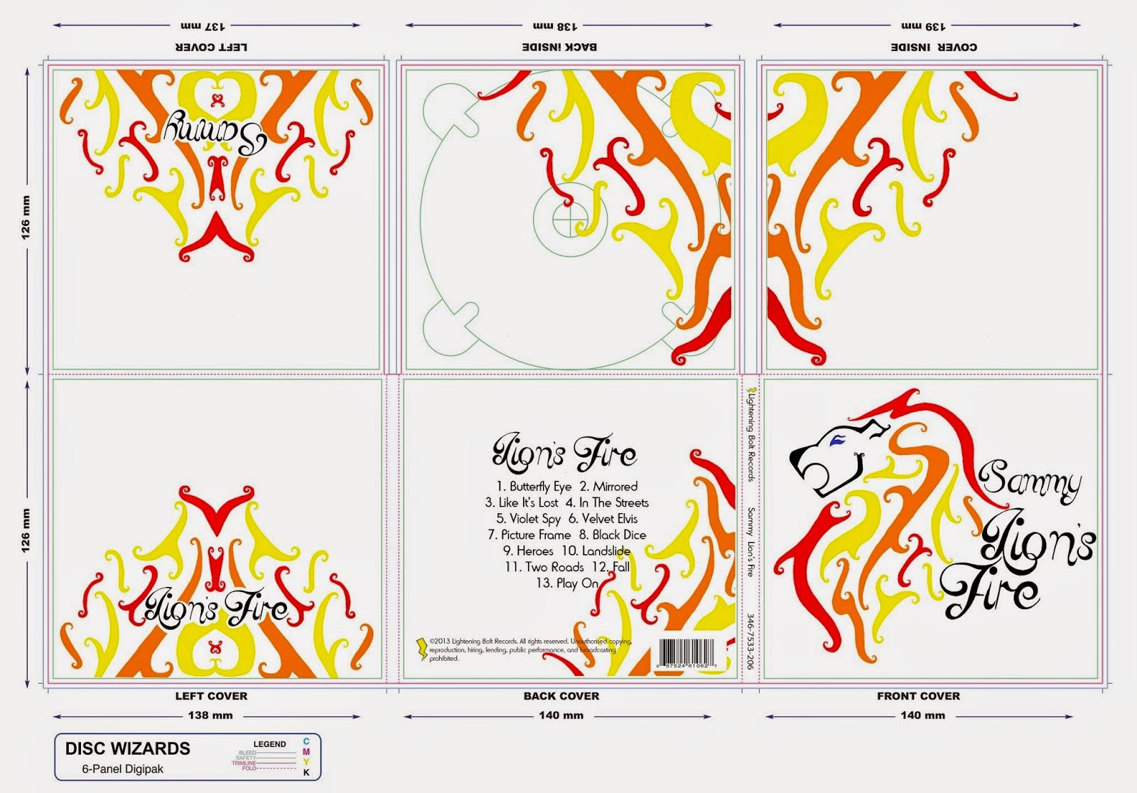
 In terms of my digipak and poster, I followed traditional conventions in having the name of the artist and title of the album on both products. Additionally, the font and main image is consistent across both items. This is because I want the audience to recognise that they belong to the same brand and therefore be encouraged to listen to the artist and buy the album. By having the image of the lion as the main image, this would lead to the audience associating Sammy with the 'logo' and could therefore lead to her building an identity as an artist - and the logo could easily be put on merchandise in order to create a greater revenue for the artist.
 However, I did challenge the idea of having a picture of the artist as the main image on the digipak and poster. Usually with young female artists, an image of them is used on the cover in order to promote them but I decided to not do this as I wanted my cover to be more artistic than simply having a photograph. Therefore I hand drew the image of the lion, and manipulated it in photoshop by adding colour and using the eraser tool to neaten edges. By having a piece of artwork on the digipak and poster rather than a photograph of the artist makes the album cover more unusual and eyecatching, so it will encourage consumers to buy the album and listen to the artist.
No comments:
Post a Comment