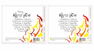
For my final digipak I have changed the colours for the Lion, making them more vibrant. By turning the dark grey face into black, the dull navy eye into a more defined blue and brightening the fire colours (red, orange and yellow) I have given the album fierceness and a sense of identity. I think the brighter colouring makes the digipak a lot more aesthetically pleasing and will therefore encourage consumers to purchase it. Another change that I have made to the lion is in the face and mouth. In the first design the face is longer and the mouth is quite small - whereas on the final design the face is shorter and the mouth is a lot larger. Again this makes the design much more refined and adds to the fierceness that I wanted to portray the artist as.
Another change I have made is to the Left Cover of my digipak. Instead of leaving it plain and simplistic, I have put the recurring image of flames on to both sides, however I have produced a symmetrical image of the flames, rather than having them climb up the side of the case as with the back cover, the back inside and the cover inside. Rather than simply layering the text on top of the flames, I have erased around the words in order to separate them from the flames so to draw in the audiences attention to the writing. I believe that this change also makes the digipak look more professional by having a constant theme of the flames on each section.
The back cover has been changed as well. To start with, I removed 'Sammy' from the page to make it look neater and removed the track entitled 'Lion's Fire' to avoid having a track with the same name as the album. I also created the record label 'Lightening Bolt Records' and produced the simple logo of a lightening bolt in order to make the digipak more professional. As with the rest of the sections, I have also brightened the flames to give the artwork a clean-cut appearance.


No comments:
Post a Comment